


Hi there, housemates,
This week, Megan C. Reynolds—author of the Your Home Is Not Ugly Substack and the writer of the story “Does a Chair Need to Be Comfortable?” from our ninth issue—returns to Wrong House for a dressing-down of the term “patina.” Speaking with Michael Diaz-Griffith and the pseudonymous Grumpy Decorator, and taking swipes at a few particularly egregious examples from brands (oop!), she makes the case that this cosplaying of history is actually the marker of a much sadder state of affairs.
—Lila Allen
⌂ ⌂ ⌂
Like what you see here? Want to support independent design media? Wrong House compensates its contributors, and your support goes directly toward producing more stories. Please consider becoming a paid subscriber.
Written by Megan C. Reynolds
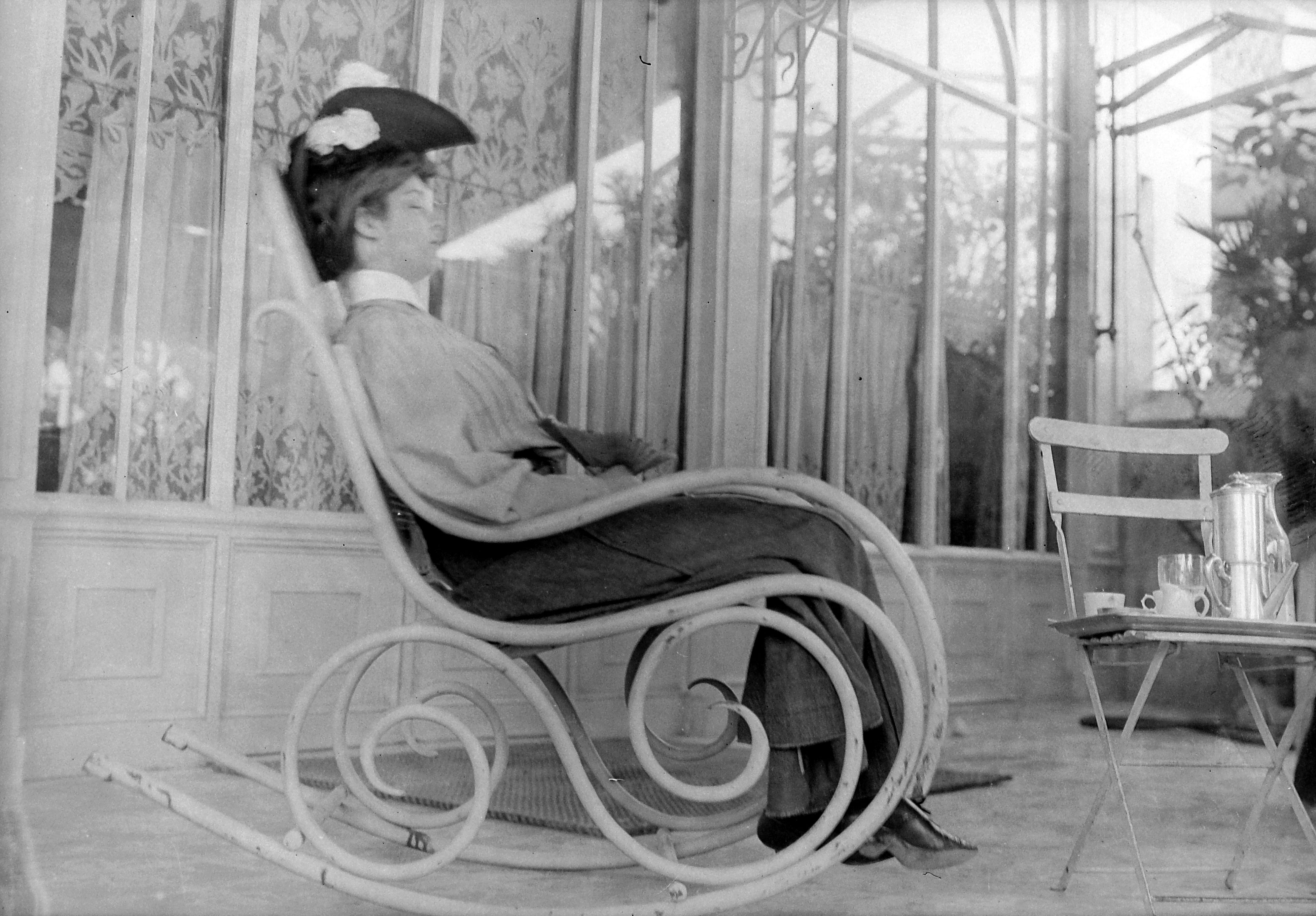
The table in my kitchen is not really a dining table—it’s a two-top from a restaurant somewhere on Martha’s Vineyard, salvaged through a friend. As a dining table, it’s not great: only big enough for one person, and square when round would probably work better. Like most things in my apartment, it’s not new; its surface is marred with water marks, stains, and divots, all signs of a life well-lived. It was also free; had it been purchased new, it’d have cost me $800 or more. And if I were to scroll on TikTok for longer than one cigarette, I feel certain that my table, or something like it, would show up in a design influencer’s video as an embodiment of “patina,” the term we’ve assigned to describe a state of having aged over time.
Depending on the material, patination can mean a few different things, all of which are the alteration of surface. For wood, it can be varnish that’s deepened in color; in metal, it can mean oxidation or even rust. The Statue of Liberty is one prominent example of patina in the wild: In 1886, when the old gal was unveiled, she was the color of a bright and shiny copper penny; by 1920, natural oxidation had cast her into a fetching shade of seafoam green. (That patinated color has taken on a life of its own, becoming so synonymous with the statue that it inspired the uniforms of the city’s WNBA team, the New York Liberty.) But in the buzzword-driven environment of mediated interiors—Instagram, magazines, TikToks—the concept of “patina” itself has transformed, becoming shorthand for an aesthetic that is inherently difficult to templatize, but implies good taste, a well-traveled life, and an appreciation and understanding of antiques.
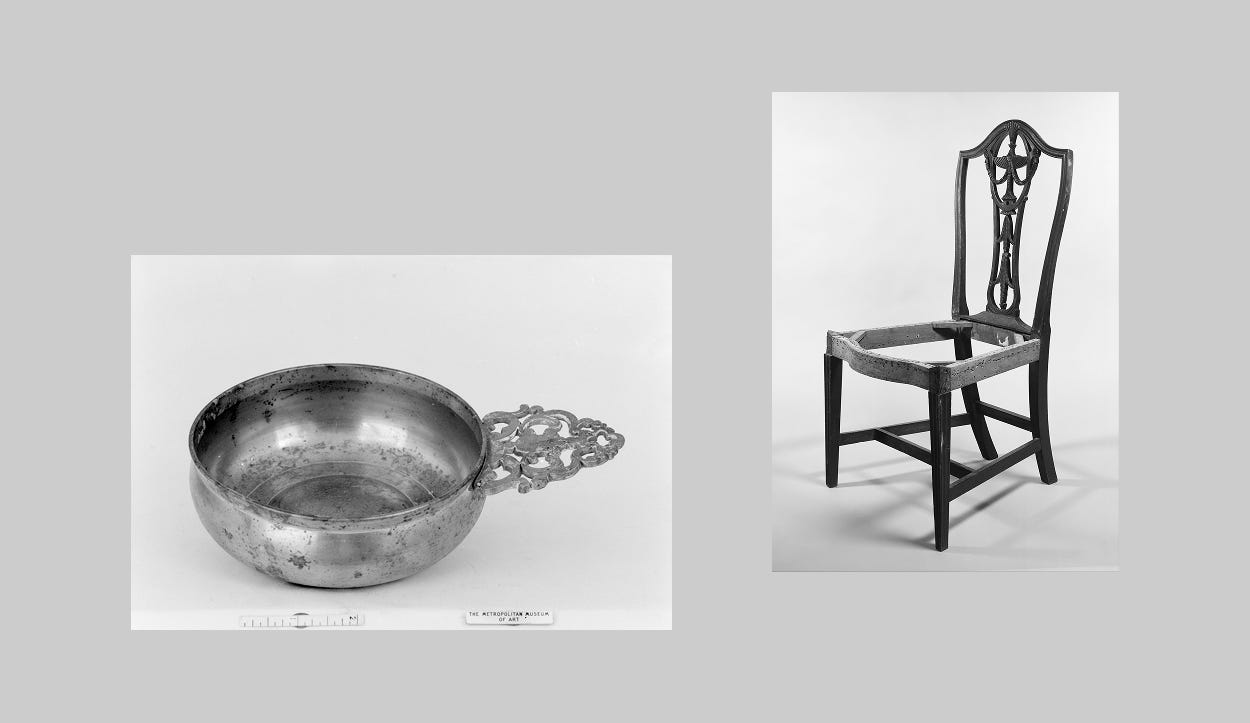
An interior that embodies “patina” is probably also described as layered, classic, collected, eclectic, or “English.” Think a “curiosity cabinet” from kitchen brand deVol—a bespoke article of (new) furniture designed to resemble something quite old. For $1,200, you can get a botanical design applied to the back of the cupboard—digitally printed but hand-finished, complete with craquelure throughout, so that you can trick your guests into thinking it’s old, when really, it is brand spanking new. There seems to be an understanding now that our living rooms should carry a sense of personal history and showcase objects that are a reflection of our interests, lifestyle, and personality. There’s nothing wrong with that—but it’s also so self-explanatory that I’m confused as to why it’s a trend in the first place. It is also remarkably difficult to replicate: My yum is very likely someone else’s yuck, and that’s perfectly fine. But there’s no universal eclectic and collected interior that works for everybody, and it cannot be standardized. So why are we even trying?
Michael Diaz-Griffith, the author of The New Antiquarians: At Home with the New Collectors, has a refreshing take on this notion—and in his experience as a writer, historian, and vice chair of The Winter Show, the country’s longest-running arts and antiques fair, “nobody talks about patina.” He says that what we’re really talking about when we talk about patina is “surface,” a metric valued by collectors that prioritizes history over perfection. And those characteristics are also what gives the object a sense of narrative and context, two crucial components that the current craze for “patina” is missing. “What’s frustrating about ‘patina’ is that it’s a word that has become slop. It doesn’t actually mean much,” he says. If you start to scroll Instagram with this in mind, the endless carousels of moody, dark, walnut-forward interiors that mix overstuffed chintz sectionals with some sort of milking stool and a bunch of oil paintings of someone else’s grandparents will all start to look like AI. The layered, heritage interior of 2026 is just a refresh of another trend from the recent past: a maximalist Ralph Lauren living room, swapping the overt Americana for a more European flair. It is not timeless by any stretch. And yet, that’s what people are asking for, without understanding why.
“For the first time ever I have clients saying they want ‘patina’ and ‘layers’ when they absolutely do not,” says The Grumpy Decorator, a pseudonymous Substack author who designs at an AD100-listed firm in New York City. In a recent post, they shared the tale of a client who kept their family dog in the garage following a home renovation so its nails wouldn’t ruin the newly refreshed floors. A lived-in interior is one that people actually spend time in, and the wear and tear on the objects in it is earned charm, argues the Grumpy Decorator. “I think this patina craze is a product of all the interior design ‘influencers’ latching onto some of the good stuff they’ve seen shared, and it snowballs,” they tell me. “I think it could also be a way these influencers are trying to gain some sense of legitimacy.”
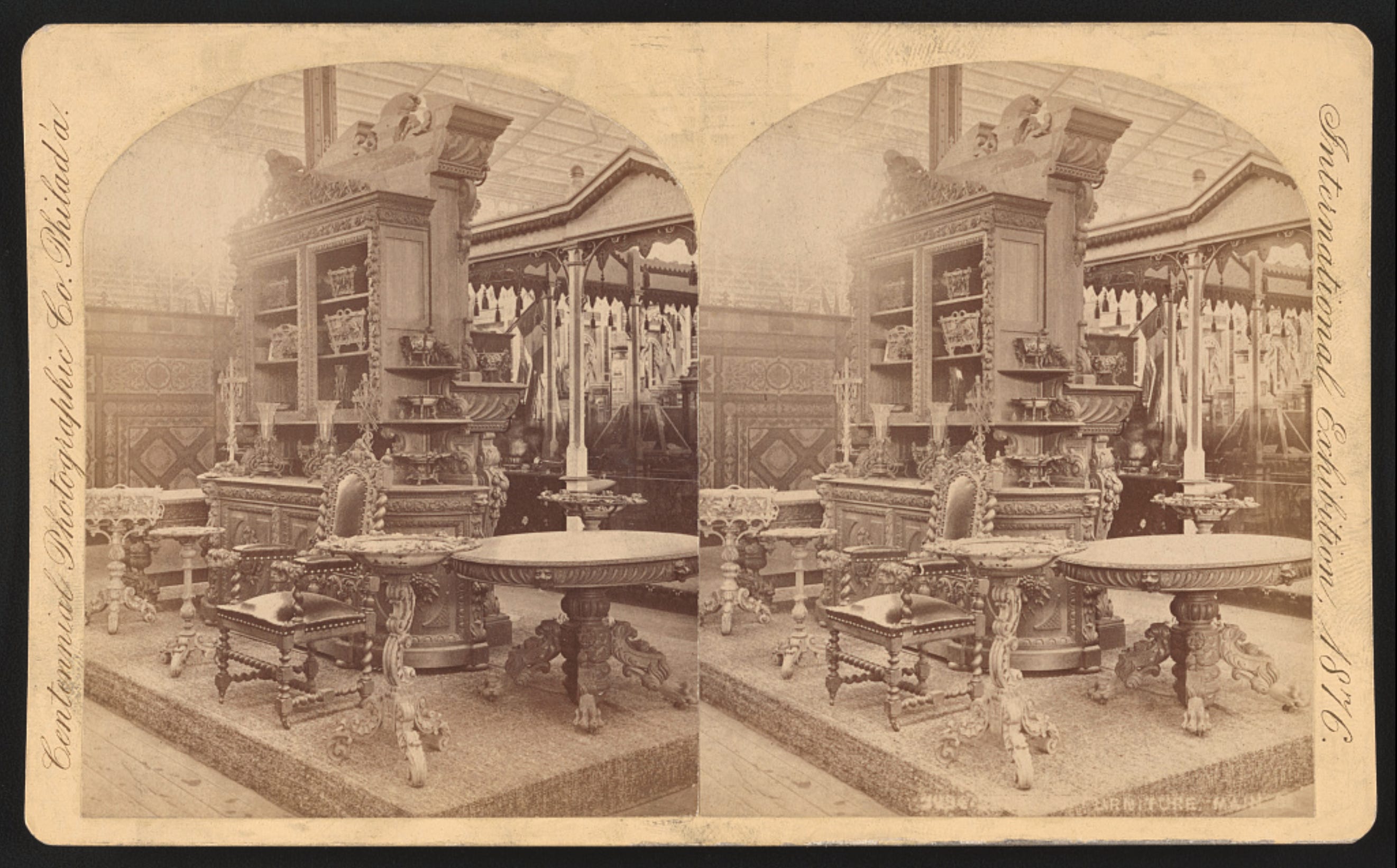
Legitimacy, in this case, presumably means the authority or the lived experience to dictate what’s in and what’s out. Unlike protein powders, lip oils, or a pair of jeans from TikTok shop, though, authority in this space requires not only an understanding of what you’re telling your followers to buy, but also why. To be clear, an intimate understanding of the decorative arts is not a prerequisite for making interior design content, but maybe it helps a little. Context is just as important as content, and patina for patina’s sake usually strips the context from the item in question. Joon Loloi’s recent collection with Drew Michael Scott, the content creator behind Lone Fox, features a polyester rug digitally printed with a design allegedly inspired by a 17th-century Belgian tapestry that hangs in Scott’s living room. “Like something out of a French chateau,” the copy screams, citing “vintage-inspired fading” as a selling point. There’s little information about the actual source material beyond its age (very old) and provenance (Europe!), but the consumer is meant to understand that that information is the point. Because the tapestry is both old and European, that’s all the context you need—and that becomes irrelevant once the new iteration of the old thing is in your living room.
“Patina,” I would argue, goes hand in hand with “piece,” a word used increasingly to describe any old item when there are other, more specific words available for use. (“I got this piece at the Rose Bowl Flea Market” could mean anything from a Danish teak credenza to a lumpen folk art vase.) Both feel full of themselves—and both are usefully vague, romanticizing the past for its own sake. And they often appear in design content that dictates rules, like the many, many videos I’ve seen where a young person green screens in front of a Jake Arnold kitchen and says that your space has to have something old in it to feel complete. To this point, Diaz-Griffith is clear: “Anyone who talks about rules is also just a con artist.”
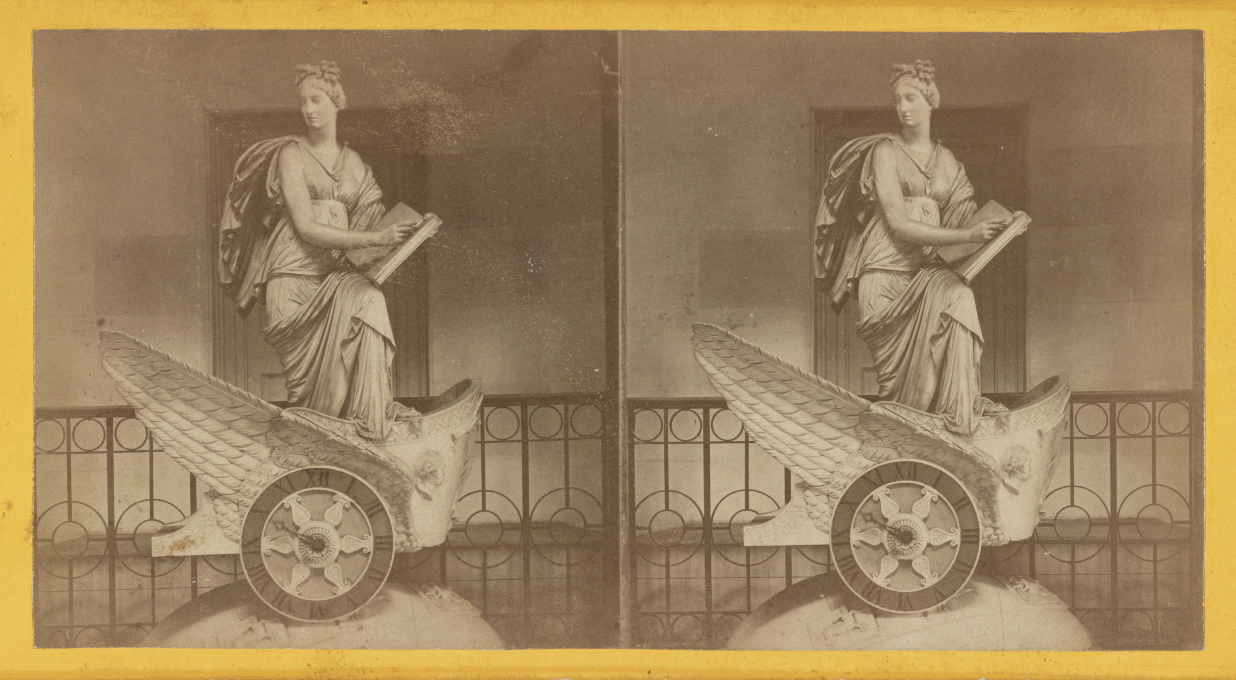
Patina might be a proxy for age—a stand-in for the notion that a chair made in the 1900s, no matter its condition, is something worth holding onto. But at some point, the thing that you’re cherishing, in part because of its age, was just another unremarkable piece of furniture that started its life new. “These objects were once all new together,” Diaz-Griffith says. “They just happen to have aged. Fetishizing them for that quality and recruiting them into an interior to provide it with this arbitrary sense of depth is specious.” Age alone doesn’t make something better than its newer counterpart, but history still matters: An antique spindle chair, imprinted with the memory of hundreds of butts, reads as less declassé than the same thing made and purchased new. Functionally, they are the same chair—but one tells a story and the other doesn’t. History trumps potential every time.
These biases aside, there are other reasons why someone would want the older thing over the new: Contemporary furniture can be astonishingly poor quality, and dupe culture has made provenance worthy of following. Sometimes, the vintage sofa isn’t superior because it’s vintage, but because it won’t crumble under the weight of your body—already, it has held the weight of countless others before you, and lived to tell the tale.
But that state of affairs might also be useful for examining why “patina” has become little more than a marketing term. The cost of furniture has been rising steadily since 2020 and tariffs have increased the price of imported goods, including furniture, kitchen cabinetry, and other upholstered pieces, all in an attempt to move production and industry back into the United States. The housing crisis has made it incredibly difficult to buy a home and renters are staying in their rental apartments for longer. And our culture is now one of convenience—our stuff is designed for a good time, not a long time, making it all the easier to dispose of your futon guilt-free when you move to yet another apartment. Oldness, of the sort that “patina” evokes, feels like a relic of an era when people could buy homes and really settle in. But now, when the very nature of living can feel transient, maybe there’s a desire for stuff that looks or feels old because of what it represents: maybe above all, staying in place long enough to accumulate something to be handed down to your children. If you can’t buy a character-filled home replete with original millwork and pocket doors, then you can make your builder-grade one-bedroom feel like it. ⌂
Megan C. Reynolds is a writer, editor, and author. She runs Your Home Is Not Ugly, a semi-frequent newsletter about design for normies.
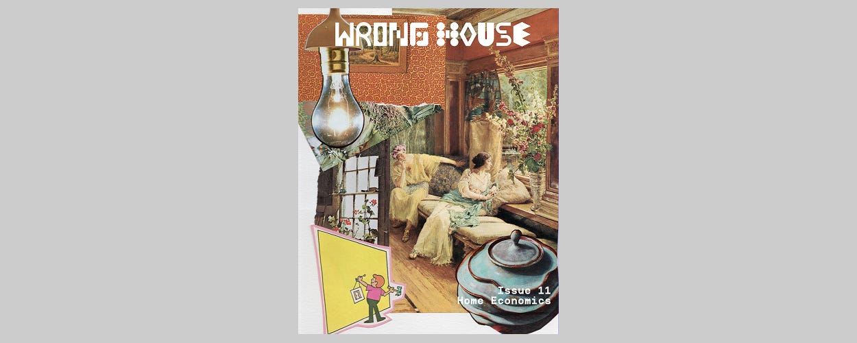
This is the second story from our 11th issue, themed “HOME ECONOMICS.”
Read the editor’s note here.
FROM THE ARCHIVE
PAST ISSUES
ISSUE 01: FINE, I’LL DO IT MYSELF ⌂ ISSUE 02: NO THOUGHTS, JUST VIBES ⌂ ISSUE 03: DON’T SIT ON THAT! ⌂ ISSUE 04: HOLIDAY SPECIAL ⌂ ISSUE 05: SWEATIN’ THE OLDIES ⌂ ISSUE 06: KITCHEN SINK ⌂ ISSUE 07: HACK JOB ⌂ ISSUE 08: OUT TO PASTURE ⌂ THE SHOE REPORT: MILAN DESIGN WEEK ⌂ A NYCxDESIGN CHORUS ⌂ ISSUE 09: GETTING WARMER ⌂ ISSUE 10: HOLDOUTS
